You've heard that first impressions are lasting, right? Here's the crazy thing — people only need 33 milliseconds to form a first impression of you based on your LinkedIn profile picture.
Seriously!
Research from The University of York found that people only need a split second to form a first impression of you based on your picture.
The kicker is that those impressions don't change with longer view times and they determine how people receive other information about you.
Translation? Your LinkedIn profile picture determines how people perceive you and everything else you've put in your profile.
If you want to make a killer first impression that leads to more job opportunities and closed deals, you need to have a great LinkedIn profile picture.
That's where this guide comes in!
I'm going to walk you through the entire process of creating a great profile picture, including:
- Why your LinkedIn profile is so important
- How to hire a great professional photographer without breaking the bank
- How to DIY your way to a great picture if you don't want to pay $$$
- 5 examples of incredible LinkedIn profile pictures from real people
- 2 tips you can use to supercharge your profile picture and get the results you want
If that sounds good to you, let's dive in!
Why Is Your LinkedIn Profile Picture So Important?
Imagine going to a fancy party where 650 million other people are invited — everyone from the person who sits across from you at work to Sarah Blakely, Satya Nadella, and Gary Vaynerchuk.
Are you going to show up to that party wearing a wrinkled dress or stained khakis with a half tucked polo? No way!
So why would you slap the stained-khakis version of a profile picture on your public LinkedIn profile where anyone can see it?
Your profile picture is your first impression on the platform and, like I mentioned earlier, that first impression happens crazy fast and it lasts.
Several years ago, The Ladders (another career site) conducted an eye-tracking study on LinkedIn profiles.
Their heat maps showed that the first thing people look for is your profile picture and, the real kicker, they spend 19% of their total time fixated on your profile picture:
Now this study is on the older side (as you can see from that LinkedIn profile layout), but data from other peer reviewed research supports the fact that if the eye tracking study were conducted again today, the results would be similar.
Check out this study from from the University of Padua in Italy called Eye Gaze Cannot Be Ignored.
The researchers found that human beings have a natural tendency to lock onto the gaze of other humans.
Remember when your parents told you to “look people in the eye?” Well, that advice is pretty much hardwired into our DNA according to the study which said that tracking the gaze of others is “strongly automatic.”
Just look at this eye-tracking heat map for Baby.com:
People lock into that gaze like a heat seeking missile!
And guess where they're going to find it on LinkedIn? In your profile picture.
If you want more profile views, more recruiters/prospects reaching out, and more connections on the platform, you need to go above and beyond with your picture.
This article is going to walk you through it, step by step.
LinkedIn Profile Picture Size & Dimensions
First and foremost, let's knock out the basic fundamentals.
When you’re uploading your profile, you need to make sure it matches LinkedIn’s guidelines and sizing so it doesn’t get reject (and looks great).
According to LinkedIn, here are the most recent guidelines for your profile picture size and dimensions:
- LinkedIn profile pictures should be a minimum of 400 x 400 pixels
- Profile pictures can be larger, images can scale up to a maximum of 4320 x 7680 pixels
- Profile pictures have a maximum file size of 8 megabytes
- LinkedIn accepts PNG, JPG, and GIF file types for profile pictures
The guidelines are pretty straightforward but following them doesn't magically guarantee an amazing profile picture that will have recruiters and prospects flooding your inbox.
There's a whole lot more that goes into your profile picture to make it pop, it all starts with the image itself. Here's how to make it count:
How To Take An Amazing Profile Picture (Without Spending A Ton Of Money)
I spend a LOT of time on LinkedIn and, by virtue of that, I see a heck of a lot of profile pictures.
Most of them just aren't great, they aren't intentional.
Whether it's a picture with friends, but all of the friends are cropped out. A shot from vacation taken by a friend or partner. An ultra-rigid photo taken by someone during a meet up, company picture day, or even school picture day…
The vast majority (I'm talking 95%+ here) of profile pictures out there are totally “meh” when it comes to making that person in them shine. Which is crazy because LinkedIn is your digital job application and part of your online brand, viewable to anyone!
I wanted to understand why more people didn't have something that made them shine, so I went out and asked.
I sent messages to about 100 people asking them about their headshot, if they've considered giving it an upgrade, and what's held them back from pulling the trigger.
Turns out, there are three main things holding people back:
- They think head shots are crazy expensive
- They have no idea how to go about finding someone to take a great headshot
- They think their profile picture is totally fine as is
I assume that because you're reading this article on LinkedIn profile pictures and you've made it this far without heading back to Reddit or Instagram, you feel like you can use an upgrade.
I hope, at least. Because we can all use an upgrade! Heck, my profile picture has some room to improve.
We're going to focus on the first two because they're easy to solve. Taking a kick ass profile picture isn't hard and it doesn't have to be expensive.
When it comes to getting a great shot, you have two options:
- Hire a professional to take your headshot (without spending beaucoup bucks)
- Roll up your sleeves and make this a DIY job
I'm going to show how to do both!
How To Turn Any Selfie Into A Professional Headshot With AI
Before we go further, a human photographer is always going to get you the best results with your headshot. That said, not everyone can afford one and hiring one can feel intimidating (not to mention taking the time to meet them for the shoot).
If you don't have the means or simply don't want to step out of your comfort zone, you can easily use AI to turn any selfie you have into a professional LinkedIn headshot in just a few seconds.
I recommend using Google's latest image model for this as it's led to the best results of any model I've tested. All you need to do is:
- Upload a selfie that offers a clear view of your face
- Use the prompt: “Please recreate this image as if it was shot by a professional photographer in a studio with excellent portrait lighting. Don’t change anything else about the subject. Don’t add anything else to the image (e.g. studio lights, etc).”
- Follow up with prompts for any other adjustments you want to make to the crop, background, coloring, etc.
This video breaks down the entire process:
Note: The key is for your new headshot to feel authentic to you and the people who'd be seeing it. The goal isn't to create something that isn't a realistic representation of yourself. That's going to hurt more than it helps.
How To Hire A Professional Photographer Without Breaking The Bank
A lot of people assume that professional photography = big bucks.
And I get it! You look at what you (or your friend) paid for those wedding pictures, maybe you Googled “professional photographer near me” and checked out their rates.
On the surface, it can seem like a big purchase. But it doesn't have to be.
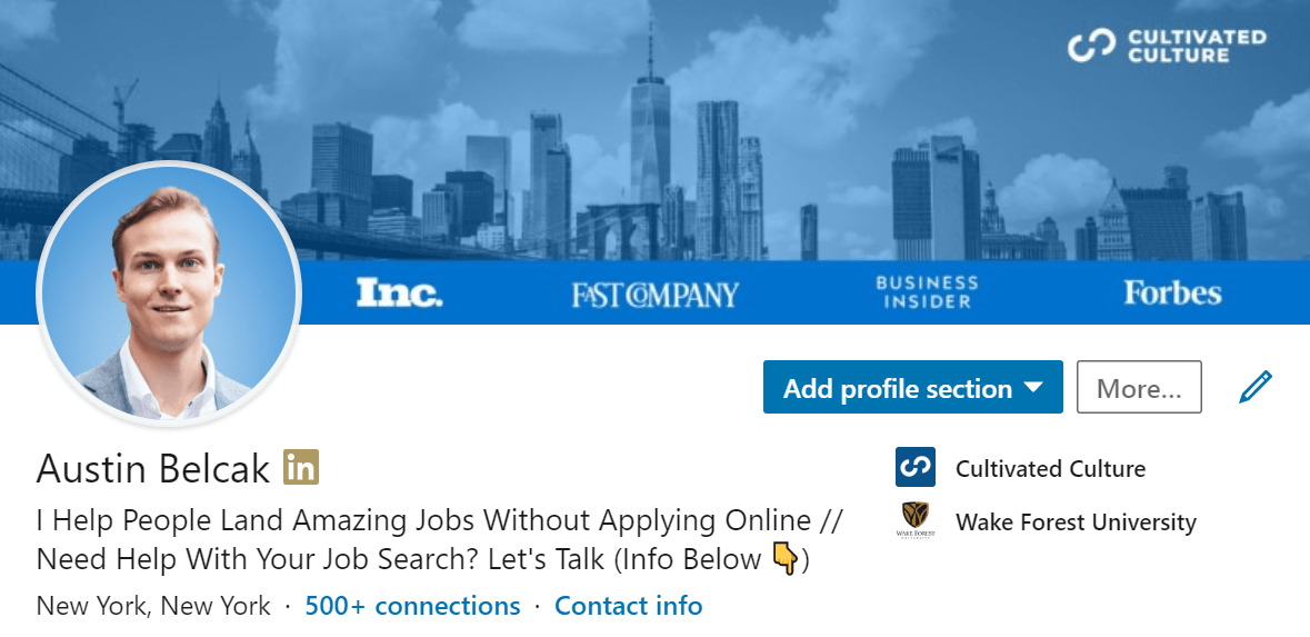
Take a look at my LinkedIn profile picture:
My profile picture is cropped from a larger portrait I had taken by a professional photographer in NYC.
Wanna guess how much it cost? About $30.
Here's the full image it was cropped from:
Not bad, right? I can use this thing all over the place!
It's my social media headshot, I use it on my website, at work, etc. That's a whole lot of bang for my buck — and I didn't even spend that much.
Guess what? There are TONS of amazing photographers out there who would kill for a paying client so they can add to their portfolio and continue to fund what they love to do.
You can typically get them for a big discount, if you know where to find them. Here's how:
Step #1: Fire up your Instagram app
Step #2: Click the Magnifying glass icon to go to the Discovery page
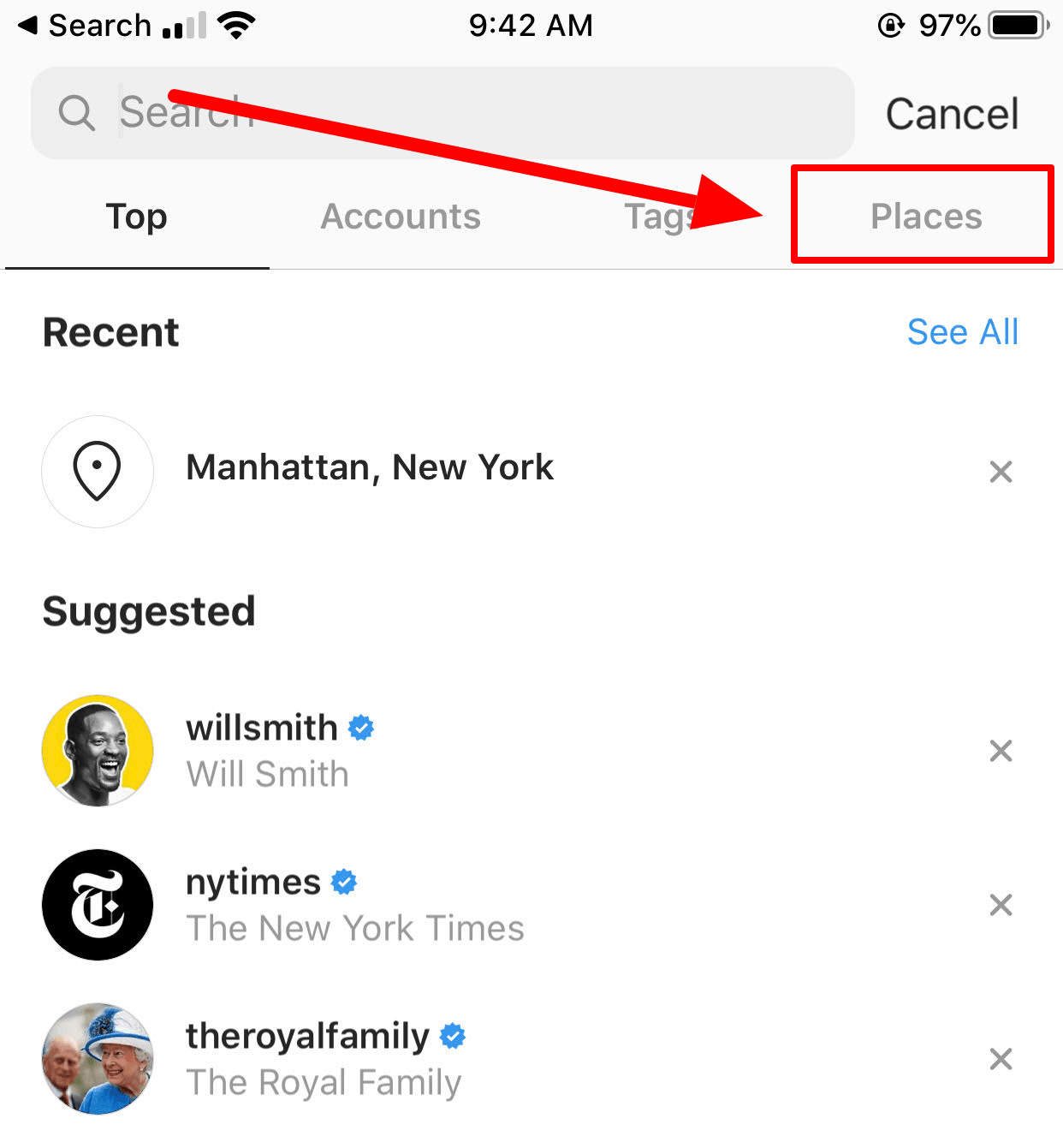
Step #3: Tap the Search Bar and hit the “Places” tab on the far right
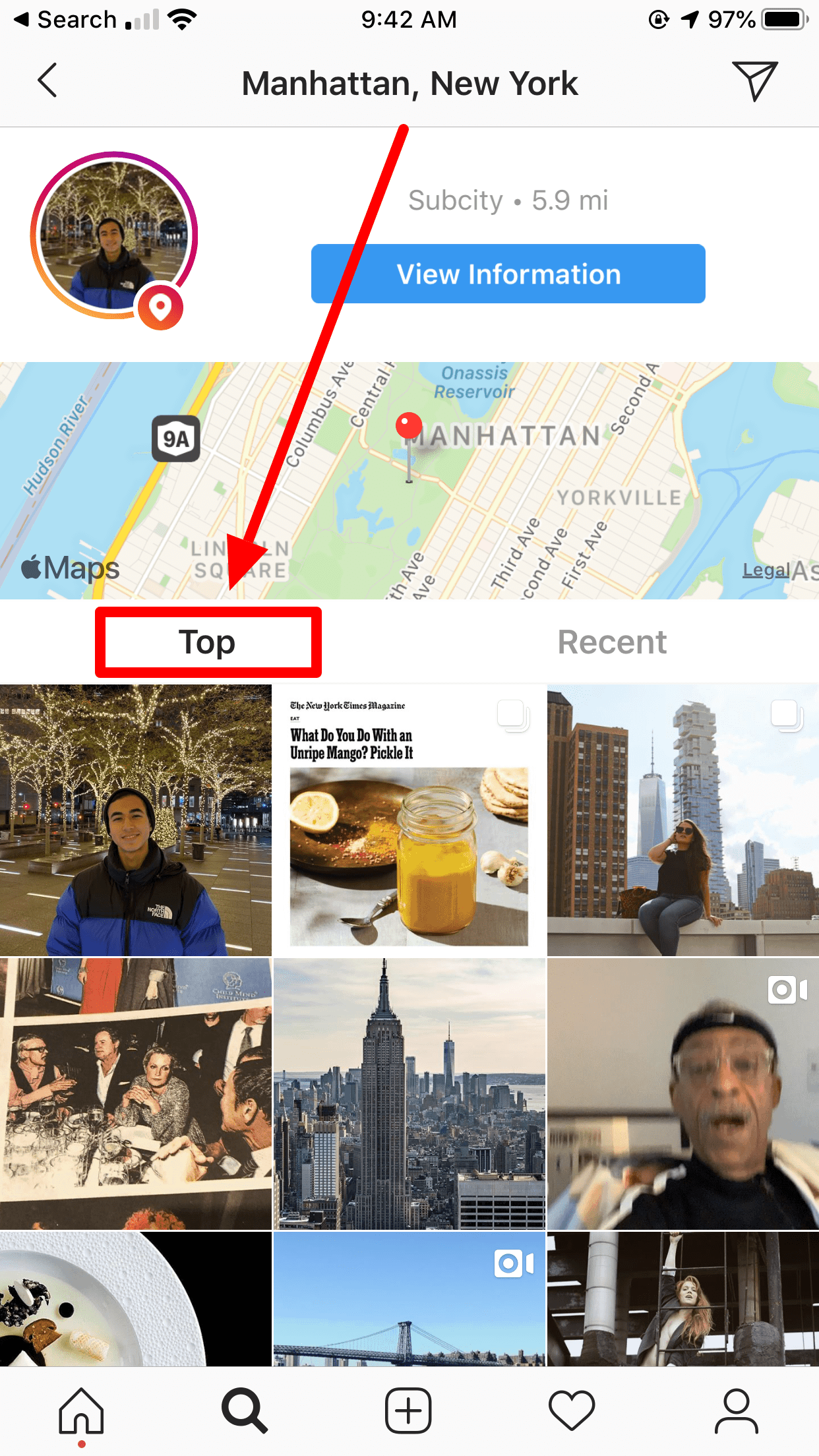
Step #4: Tap the “Near Current Location” button and select a happenin' spot within driving distance of where you live
Step #5: Select the “Top” filter below the map to see the best recent photos
Step #6: Scroll through the photos keeping an eye out for awesome portraits or shots that stand out to you
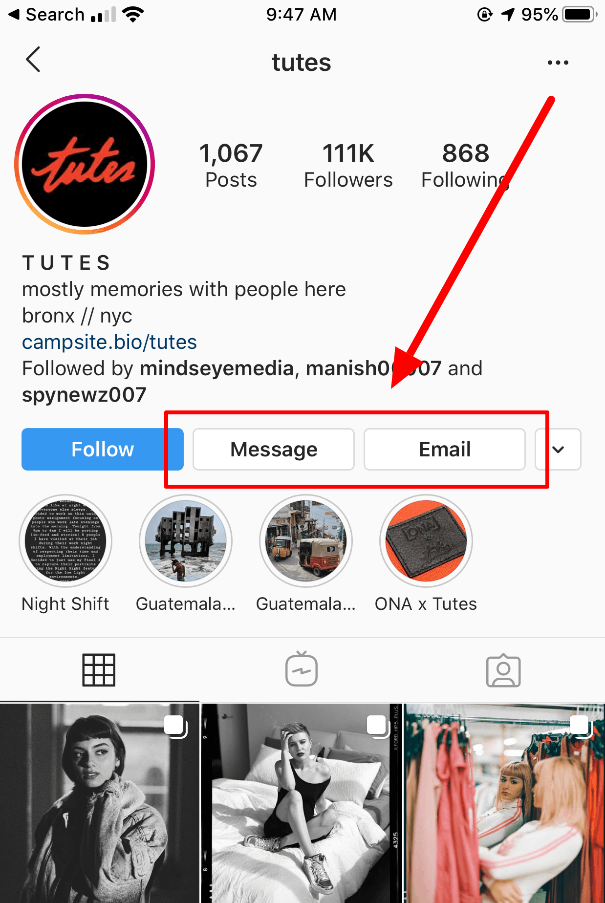
Step #7: When you see a picture you like, tap on it, then tap the handle for the person's account to go to their account page. Scroll through the rest of their photos to see if they're still your vibe.
Step #8: If you like what you see, most photographers will have their contact info in their profile. Look for the Message or Email buttons, or keep an eye out for a website or email address in the profile. Worst case, you can shoot them a DM:
If you're not sure what to say when you're reaching out here's exactly what I sent to the photographer I ended up hiring (I shot him an email and a DM on Instagram):
Subject: Quotes for a shoot?
Hi Josh,
Been following you on Insta for a while and love your work.
I'm looking to get some professional shots taken for my site. Would love to work with you. If you're interested, could you send me your rates?
Best,
Austin
Make sure to email a few different people, you want to make sure that you have options and room to negotiate.
As an added bonus, if you hire them to take a headshot you can probably squeeze in an awesome cover photo as well. Two birds, one stone!
Side Note: For my people out there who have the budget to afford an amazing headshot and want a one stop shop, I recommend checking out Headshot Crew.
They will hook you up with an amazing photographer and headshot in no time flat. If you have the money, this is the easiest and best way to lock in an amazing headshot.
How To DIY Your Way To An Awesome Profile Picture
Ok, so maybe money is tight or you're just not ready to pull the trigger on a professional photographer yet.
Fair enough, but that doesn't mean you're off the hook! You can still snap a super high quality profile picture from the comfort of your own device.
You just need a camera with portrait mode and a tripod or a friend. After that, just follow these steps:
- Wait for a clear, overcast day or find an area with indirect sunlight (direct sunlight is harsh and will make you squint)
- Find a location with a great background — I personally like cityscapes or something natural like trees, etc. although you can have fun with your background too (as you'll see in our examples below)
- Fire up portrait mode on your camera and take at least 10 images (you’ll be glad you went overboard, I promise)
- Make sure to SMILE big! There's is a lot of research showing that we prefer images of people showing off their pearly whites
- Using editing software to enhance the colors of the image and adjust it until it looks awesome.
I'll emphasize that more pictures is better here. Try different outfits, different backdrops, and different angles.
The more shots you take, the more material you have to work with, and the more likely you are to end up with something great!
Add Some Pizzazz To Your Profile Picture
A great image can make for a great profile picture, but there's a lot more we can do after the shot is taken to upgrade your look!
This video walks through two free tools you can use to upgrade your profile picture in less than 30 seconds:
If you're someone who likes text over videos, here's a rundown of what I covered in the video.
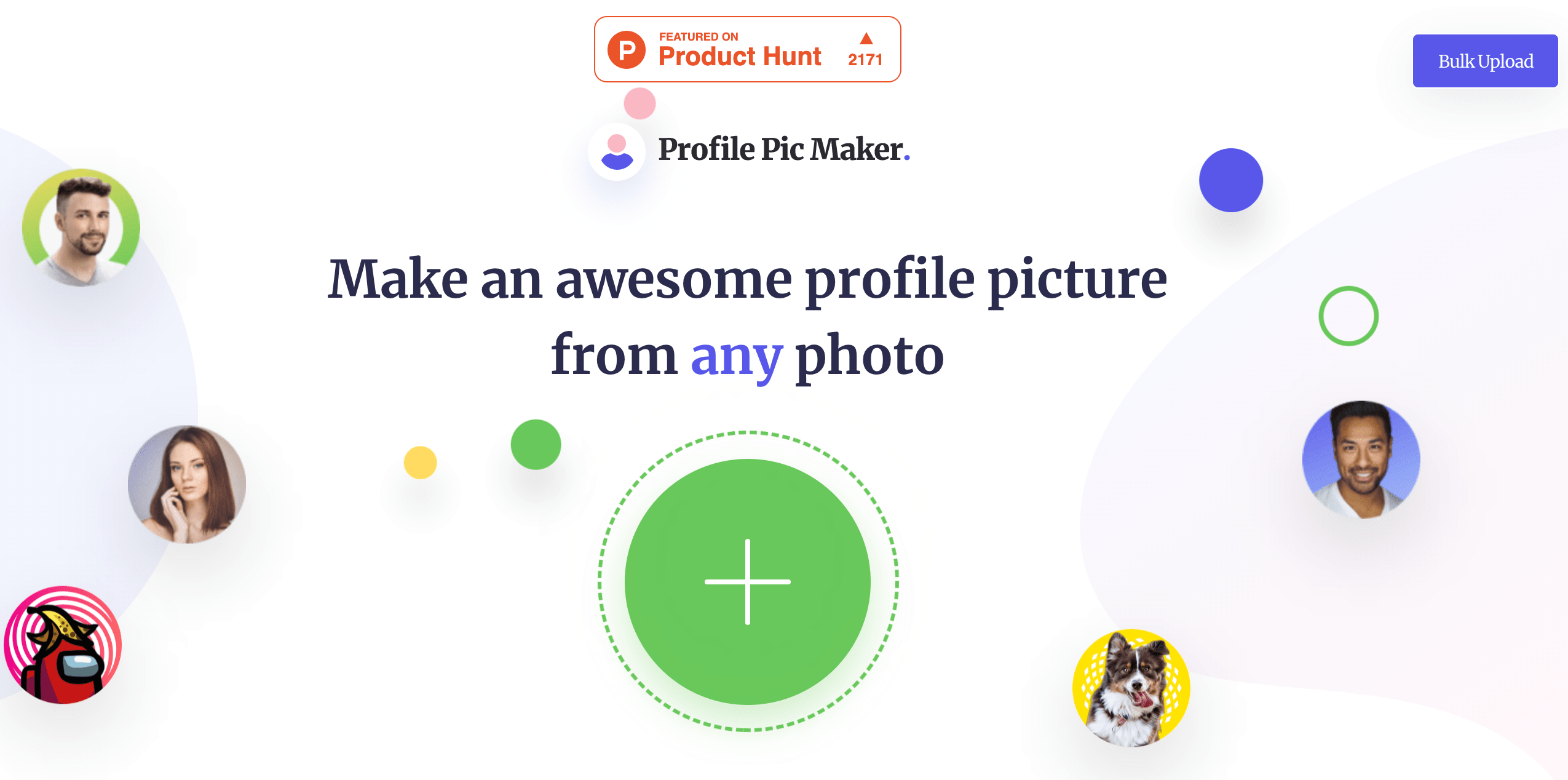
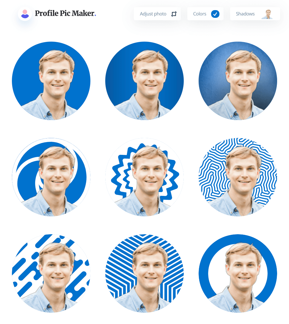
When you have a great image ready to go, check out PFP Maker for some extra oomph! PFP Maker is a free profile picture tool that lets you upload your image and adjust backgrounds, colors, shadows, and more:
All you need to do is upload your image and PFP Maker will give you 50+ profile picture options with different backgrounds and effects. Here are some examples from a quick 5 second upload (notice how you can crop your photo, choose colors, and select different shadow effects in the upper right):
Now these designs and backdrops may or may not be for you, but they're worth checking out. At the end of the day, you should lead with a profile picture that makes you happy!
Austin's Recommendation: Hire The Professional Photographer If You Can
Now that you know how to find a great deal on professional shots, I want to talk about why its worth the money (I did mention that mine was only about $30 right?!).
I've spent a lot of time talking about how your LinkedIn profile picture conveys a first impression, how it should make you shine, and how it should be a window into your personality.
Professional photographers use images to tell stories. That's literally their job.
If you give them a chance to get to know you and the message you're trying to convey, they can make sure that shows in the final image. They're going to be able to do a MUCH better job of that than an amateur with a DIY setup.
And it's going to make a difference in your LinkedIn engagement, I can promise you that.
Finally, professional photographers will guarantee success in another critical element of your profile picture — quality.
A professional's image is going to be high resolution, taken in great light so you end up coming out crystal clear.
If your profile picture is super high quality, that's going to stick with your first impression and that's how the info on the rest of your profile picture is going to be viewed.
If you're still not sold, you don't have to take it from me. But check out why my buddy Justin Welsh has to say here, he knows what he's talking about:
5 Great Examples Of Killer LinkedIn Profile Pictures
Let's take a look at a few examples of awesome profile pictures from real people on LinkedIn.
I'll break down why they're great so you have something to reference and compare your shiny new picture to! Here we go:
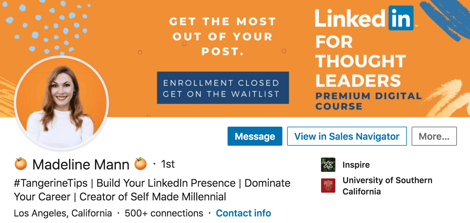
During the day, Madeline Mann is a Talent Development Manager at a company called Inspire. But outside the hours of 9-5, she jumps in the phone booth and dons a tangerine super suit and shares awesome advice to help people accelerate their careers.
Madeline's picture is awesome for a few reasons:
- She's got a big smile on her face
- She's wearing an outfit that authentically her (she's not trying to go overboard with the professionalism and she's definitely not too casual)
- She purposefully used a bright, happy, eye-catching orange background
Now Madeline has taken her game to the next level by fully branding her profile from top to bottom (matching profile picture and cover photo, her own hashtag #tangerinetips, etc.):
You don't have to go this far, but dang — look how crisp and professional that looks! Madeline's immediately giving off an air of credibility when you look at her profile.
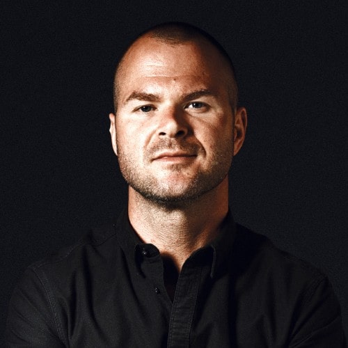
You just met Justin a second ago, not only does he talk the talk but he walks the walk when it comes to profile pictures.
Justin is a no BS, get-it-done sales guy and that's exactly how he brands himself online. He shows up that way in the content he writes, the comments he shares, and his profile picture.
I love the black-on-black aesthetic here (another example of getting creative with the background and color scheme) and Justin's expression is saying, “You need to ramp your sales up to $50M recurring? That's what I do.”
Justin's picture is a great example of awareness and personal branding. I mentioned earlier that your personality should shine through in your picture. If you're not the bright colors, giant smile kind of person – that's totally cool! Your profile picture should reflect that.
Rachel Montañez is a coach who helps people with careers and burnout (two very important things!). She's also totally crushing the LinkedIn profile picture game.
You can feel the warmth in her picture! I'm hazarding a guess that a professional took this, but it's a great example of why those dollars are worth it. You feel like Rachel's energy and personality are radiating out of the image. It's hard to DIY that.
Sami Viitamäki is here to show us that black and white can be a great combo to leverage. B&W images have a wide range of emotions — they can make things severe or they can soften them (like it does in this case).
Sami's profile picture gives off a sense of trust and honesty. That's due to his neutral-positive expression, but also the black and white coloring making his eyes the focal point of the picture.
Also, notice how Sami's picture is taken from the neck up whereas the other examples here are taken from the chest up. Sami's face takes up more of the frame, making him seem “closer.”
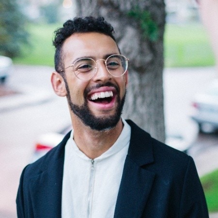
Tynan Allan is a director at CULTURELABx and a champion for the right kind of company culture. I absolutely love his profile picture for two reasons:
- That expression is amazing! It looks like Tynan is having a 10/10 day and that's going to give anyone looking at his profile a mental boost
- He's showing us that you don't need a solid/color block background to look good (I'm with him on this one!)
Boom! There you have it — five truly awesome examples you can use to model your next profile picture.
2 Tips To Give Your Picture An Extra Boost
At this point you should know how what a great LinkedIn profile picture looks like and how you're planning to upgrade yours (hiring a professional vs. DIYing it).
Now I wanted to share a tip to help make sure your next profile picture is a game changer, as well as an experiment you a run to help increase your profile views!
Tip #1: Use Photofeeler As A Personal Focus Group For Your Picture Options
What if there was a way to know exactly how people would feel about your new profile picture?
Well, there is! And you don't need ESP to make it happen.
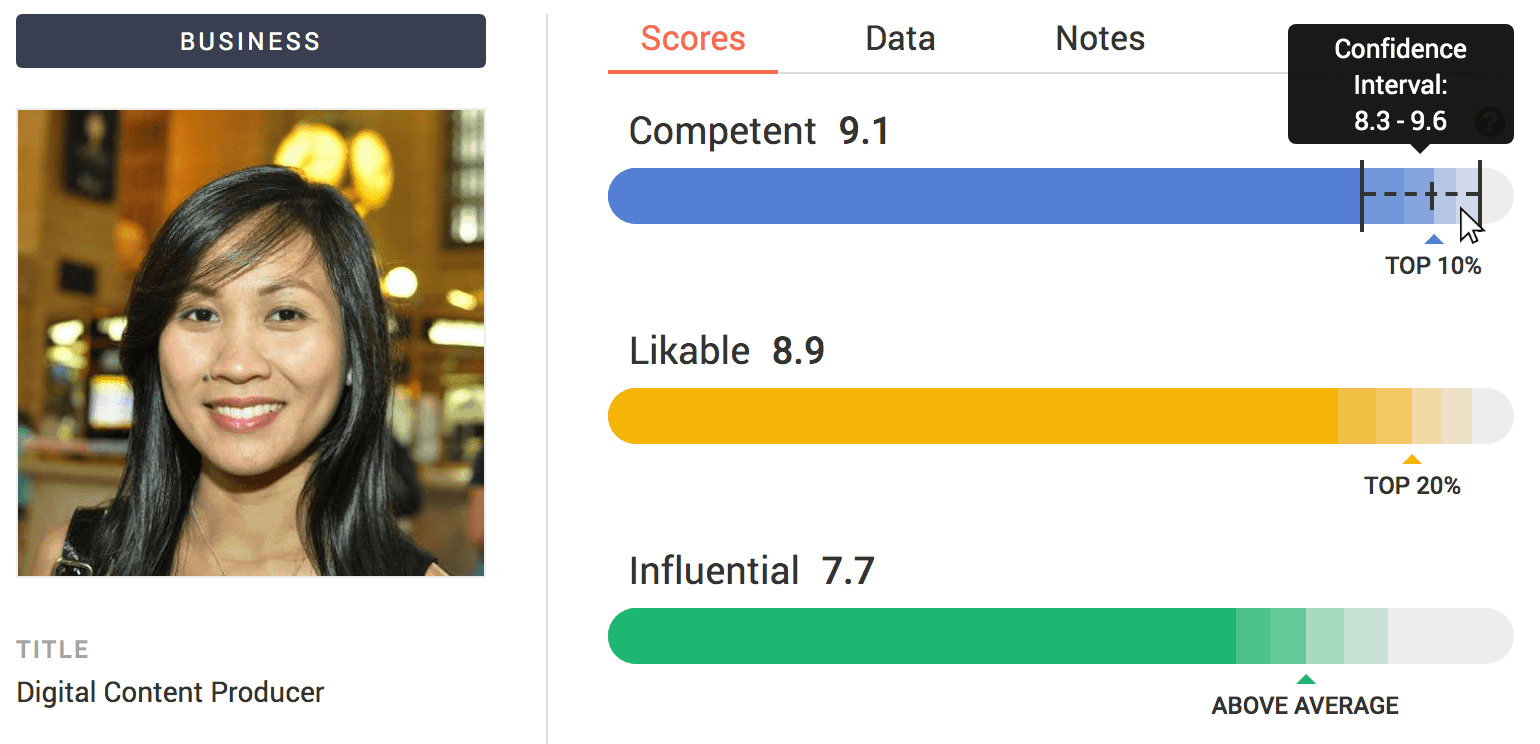
There's a great tool out there called Photofeeler which lets you post your photo and have other people grade it:
I know, I know, it sounds a little corny (like a modern day Hot or Not) and a bit terrifying — but it's absolutely worth it!
I like Photofeeler because it lets you set the context for your picture (are we looking at your next Tinder profile pic, or is this for LinkedIn?). It also gives you empirical feedback based on criteria that actually matters. Your picture will be scored on things like:
- Likeability
- Trustworthiness
- Intelligence
- Comptency
- Etc.
You may think your profile picture is killer and portrays you exactly the way you want, but the data may say otherwise. It's important to get that info before you post!
Tip #2: Try Adding A Colored Circle To Your Profile Picture
In the digital marketing world, there's a metric called Click Through Rate (CTR).
This metric shows you how many people clicked on your ad out of the total number of people that saw it. For example, if 1,000 people saw my ad and 10 clicked on it, I'd have a 1% CTR.
This is super important because optimizing for click through rates means more clicks on our ad.
This same methodology applies to your LinkedIn profile!
If you head over to your profile, you'll see a section called “Your Dashboard” with metrics like profile views, post views, and search appearances:
While it's great to show up in tons of searches, it doesn't really mean anything if nobody is clicking through to your profile! That's our very own career-focused CTR right there.
If we want to improve the click through rate to our LinkedIn profile, we need to take a step back and think about what happens when people run a search.
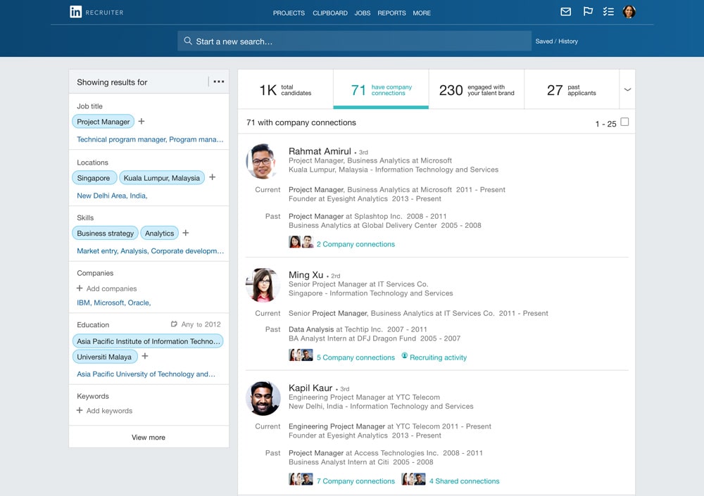
On LinkedIn, recruiters use a tool called LinkedIn Recruiter to run searches for candidates. Here's what those results look like:
When we optimize for click through rate, we can only work with what we see here on the results page — your name, your location, your industry, your headline, your recent jobs, and your profile picture.
What were your eyes drawn to when you looked at those results? Was it the text based on content or was it the people's profile pictures?
You can mess with your headline all you want, but the real bang for your buck is in that image.
And this doesn't just go for job seekers. You'll find the same thing when you run a search for prospects or potential connections!
Like the research showed at the beginning of this article, we lock onto that human gaze.
So with that in mind, how do we make our image stand out even more?
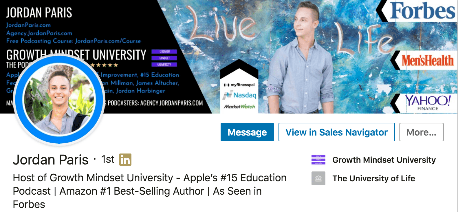
Well, one tactic people have been testing out is adding a colored circle around the edge of their profile picture like my friend Jordan Paris did here:
These circles can help make your profile picture stand out from the other profiles showing up on the same search results page.
If you're interested in testing it out, here is a step-by-step breakdown of the process:
-
- Head over to Canva.com
- Either select a pre-made template with a square aspect ratio, or create your own with custom dimensions (it's super important that the image is a square)
- On the left rail of Canva's editor, go to the Elements page, then scroll to Frames and click See All
- Scroll down until you find the circular frame with the ring around it (there are frames with thin and thick borders depending on your preference)
- Click on the frame you want to add it to the editor, then drag to expand and fill the canvas
- Go back to the left rail in the Canva editor, click Upload, and upload the image you want to use as your profile picture
- When the image is uploaded, drag and drop it into the frame
- Use the color selector in the upper left hand corner of the editor to choose the color you want
- Download your final image as a PNG and save it somewhere that's easy to find
- Head back to your LinkedIn profile, click your profile picture and hit edit
- Upload your new profile picture, adjust the sizing to include the colored border, BOOM! You're all set!
After you upload the picture with the colored border, keep an eye on your profile view metrics.
If they go up and you haven't made any other changes, you can assume that the bump is due to your new color pop and it's probably a good idea to stick with it!
Still have questions about your LinkedIn profile picture?
I included as much info as I could think of in this post, but I'm sure you'll still have questions or suggestions (which is great!). I'm always open to feedback and I'm always happy to help.
If so, drop a comment below the post here. I read and reply to every one of them!
📚 Want More LinkedIn Advice? Check Out Our Guide: How To Use LinkedIn For A Job In 2024 [Free Guides & Tools]





















Hi Austin, great content!
If I have 2 or more photos with good rate on photofeler, but which one have a better evaluation on different characteristics. Thinking about Linkedin which item (Competent, Likable or Influential) is the most important in your opinion?
Thank you!
Great question Evandro! I would go with the one that you like best in that situation. If they’re both rated well, you can’t really go wrong!
I am new to LinkedIn and I don’t even know that to set and create profile picture on LinkedIn. After reading this article I came to know that to do it. I will surely apply these tips which are mentioned in this article for better results.