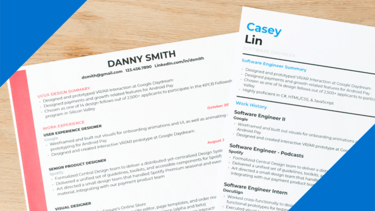
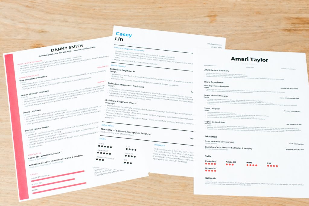
As the old saying goes, you never get a second chance to make a first impression. And, when applying for jobs, the first impression you make will usually be via your resume and cover letter — which is why every detail counts, even the resume layout.
On that note, when crafting your resume, the specific wording you use (e.g. summary, job responsibilities) will obviously be critical. But, in addition to the content, you also need to consider the structure and format.
A sleek, compelling resume layout will make your background and experience shine — while a clunky, disorganized layout may get your resume tossed out. This may sound a bit harsh, but remember: there will be dozens, if not hundreds of other resumes in the stack…and you’re competing against all of them.
So, in this article, we’ll be exploring:
- Why your resume layout matters
- Different types of resume layouts (and what to include in each)
- Tips on how to format a resume
Let’s get started…
Why Your Resume Layout Matters
As mentioned above, your resume serves as the first impression you make on recruiters and hiring managers. So, it’s important for your resume layout to not only convey the appropriate information but also look sharp in the process. Humans are inherently visual creatures and, as such, we respond strongly to design and aesthetics.
That being said, the function of your resume’s layout/format goes beyond aesthetic appeal. Another, perhaps even more important feature is scanability. When hiring managers receive an influx of applications, they often sift through the pile hastily, scanning each resume for only a few moments in search of one that truly ‘grabs’ them.
So, if your resume layout promotes quick-and-easy scanning, you’ll boost the chance of catching their attention. On the other hand, if your resume layout is dense and/or disorganized, that’ll count as a mark against you.
Different Types Of Resume Layouts
Now that we’ve reviewed why resume layouts are important, let’s break down 3 tried-and-true layout types you can use:
Chronological
This is the most common, classic resume layout. In a chronological resume, your work experience will be listed in reverse order with the most recent position at the top. Ultimately, your experience and education should make up the bulk of the resume.
A chronological resume will typically be structured as follows:
- Contact Info. Name, email, phone, address, social profiles, website.
- Resume Objective. A concise paragraph or bulleted list that highlights your strengths/experience.
- Work Experience. A list of previously-held titles, including dates, company, and bullet points to describe responsibilities and achievements.
- Education. A list of degrees and certifications from accredited institutions.
- Skills/Interests. Most people would include a list of job-related skills here, but be sure to check out my article on how to create an unconventional skills/interests section that will set you apart!
- Additional Info. You can use this last section for other noteworthy points (e.g. references, volunteer work, organizations, awards, etc.)
As the traditional option, this layout is suitable for most job seekers — particularly those who have a steady track record of relevant career advancement. (Candidates with non-traditional backgrounds or gaps in their work history may want to consider the other two layout types below.)
Functional
In a functional resume, the main focus is shifted from your work experience to the relevant skills you possess. You can still list previous positions you’ve held, but the skills section will come first (with a detailed description for each skill) and take center-stage within the layout.
A functional resume will typically be structured as follows:
- Contact Info. Name, email, phone, address, social profiles, website.
- Resume Objective or Skills Summary. A concise paragraph or bulleted list that highlights your skills/strengths.
- Skills. List of pertinent skills, along with a detailed description for each (ideally referencing past achievements as proof of your ability).
- Work Experience. 1-2 previously-held titles that are related to the current role you’re applying for, along with a brief description.
- Education. A list of degrees and certifications from accredited institutions.
- Additional Info. You can use this last section for other noteworthy points (e.g. references, volunteer work, organizations, awards, etc.)
Functional resumes can be beneficial if you have an inconsistent work history or are coming from a non-traditional background. However, it should be noted that this layout type is less common, which could throw some readers off a bit.
Combination (Hybrid)
A combination (aka hybrid) resume layout aims to emphasize both your work experience and skills, rather than placing more weight on one or the other. The order of the sections will be similar to a functional resume layout, but the experience section should be more in-depth. Consequently, you may need to drop the ‘Additional Info’ section to make room.
A hybrid resume will typically be structured as follows:
- Contact Info. Name, email, phone, address, social profiles, website.
- Resume Objective or Skills Summary. A concise paragraph that highlights your skills/experience or explains your career intentions.
- Skills. List of pertinent skills, along with a 1-2 sentence description for each (ideally referencing past achievements as proof of your ability).
- Work Experience. A list of previously-held titles, including dates, company, and bullet points to describe responsibilities and achievements.
- Education. A list of degrees and certifications from accredited institutions.
Combination resumes are a great option for highly-qualified individuals who have both an impressive background and a sought-after skillset. You should also consider this layout if you’re coming from a non-traditional background, as it allows you to draw attention to any relevant skills from previous roles that could potentially carry over.
Tips On How To Format A Resume
Now that we’ve discussed layout structure, let’s turn to some aesthetic considerations. Here are some general guidelines to keep in mind when formatting your resume:
Use a simple, professional font. Your resume is not the place for fancy or fun fonts. Instead, use a basic, easy-to-read font like Arial or Calibri (in 10-12 pt. size).
Keep it consistent. Make sure you’re using the same capitalization, punctuation, and grammar throughout the document (e.g. periods at the end of bulleted sentences)
Embrace bullet points. Returning to the concept of scanability, a bulleted list (especially in the Work Experience section) is often better than a block of text
Be mindful of margins. Frame your resume with neat 1-inch margins on the sides and 0.5-1 inch margins on the top and bottom (depending on how much space you need).
Highlight sections with bold headers. Preface each section with an enlarged, bold heading to set it apart (e.g. ‘Education’).
Spice it up with color. Go beyond the blandness of black-and-white by adding some color to your headings or margins. But, don’t make it too bright — opt for mellow colors like blue or burgundy.
*For a convenient, done-for-you resume layout/formatting solution, head over to my collection of Free Job-Winning Resume Templates!
Perfecting Your Resume
We’ve now covered the essentials to guide you toward a crisp, professional resume layout. But, while important, the layout is only one piece of the puzzle. There are other key factors to take into account, particularly in regard to the wording you use in each section.
With that in mind, if you’re interested in creating a stellar resume that’ll get you noticed, you’ve come to the right place! I’ve created the following resources to help you perfect your resume and get one step close to that dream job!
- How To Write A Job-Winning Resume
- 175+ Action Words To Supercharge Your Resume
- ResyBullet.io – Free Resume Bullet Analyzer
- ResyMatch.io – Free Resume Scanner
And, lastly, if you’re in the market for a new job, don’t miss my complete guide on How To Get A Job Anywhere With No Connections!
